Creating an Intuitive User Experience: How Wilqo Simplifies the Loan Process
At Wilqo, we have 3 objectives for our customers’ loans:
- Get them done quickly
- Be sure they are accurate
- Keep them in compliance
We understand that a complex user interface (screens, fields, tabs, menu options, etc.) can slow down the process, increase errors, frustrate users, and introduce compliance risks.
That's why we've made simplicity one of our core differentiators.
Only What You Need, When You Need It
Imagine logging into your core business system and seeing only the information you need, right when you need it. That’s exactly what Wilqo offers in Charlie, our Production Optimization Platform (POP) that replaces legacy POS and LOS solutions. Charlie dynamically adjusts what’s displayed on the screen based on your role, information previously collected about the loan (i.e., FHA fields only show up for FHA loan programs), and specific configurations. Whether you're a loan officer, underwriter, or processor, you’ll only see what’s relevant to you at that moment, reducing distractions and helping you focus on what truly matters.
Highly Intuitive Interactions
Wilqo’s interface is designed with intention. We limit the potential for overwhelming users by presenting data in digestible formats.
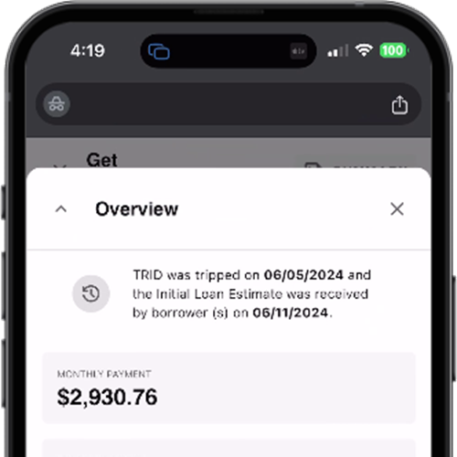
For example, our information cards highlight key data at the top of key pages, allowing users to quickly access critical information without digging through multiple tabs or fields:

The type of data that gets collected changes based on the circumstances of the loan. For example, the bottom screen below shows the addition of a Government section when the loan gets flipped from Conventional to FHA:

There is no need to display that Government tab for a conventional loan.
The Benefits of a Streamlined User Experience
This approach isn’t just about aesthetics—it’s about functionality and efficiency. By simplifying the user interface, Wilqo helps reduce errors that could lead to costly delays or cures, streamlines the loan process, and accelerates the learning curve for new hires. A faster learning curve means your team becomes productive quicker, helping to move loans through the manufacturing process with fewer opportunities for something to change or fall out.
And, because the flow can be controlled through configuration settings, you will sleep better knowing each loan is maintaining the appropriately compliant workflow based on the program selected.
Enhanced Borrower Experience
A simplified system also leads to a better experience for borrowers. Remember, with Charlie the borrower is just another actor on the loan working in the same system as everyone else. The elegance of Charlie’s user experience will make your borrower’s interaction with you simpler for them—increasing their overall satisfaction with you as a lender.
Configurability
While Wilqo's design philosophy emphasizes simplicity, we understand that flexibility is essential. Our screens can be configured to display more data if needed. However, our team will work closely with you to ensure that additional information enhances your workflow. We’ll challenge any requests that might lead to "the way we’ve always done it" thinking, ensuring that any changes contribute to improving the user experience.
In summary, Wilqo's focus on a simple, intuitive user experience doesn't just make our platform easier to use—it makes your entire lending process more efficient, accurate, and customer-friendly.
Share this
You May Also Like
These Related Stories

Streamline Your Loan Origination Process with Wilqo's Get Qualified Workflow

Introducing the First Production Optimization Platform (POP) in the Mortgage Industry

